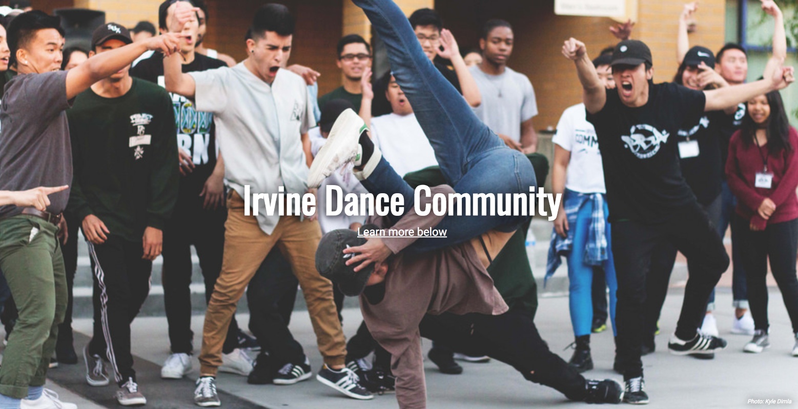

A webpage that showcases the various dance teams based at the University of California, Irvine. UCI has an incredibly active urban dance team community and this page aims to consolidate team information and social media links in one place.

Every college has its interesting little quirks that make it unique. UCI has people on Ring Road yelling "$2 boba", the enigmatic Swagman who can be seen walking around campus, and of course, dance teams practicing late at night on campus. I auditioned for MCIA my senior year and it was probably one of the most fun things I've been a part of in college. The love for dance, the community, and how it helped us students grow and find families on campus meant a lot to me. Talking to some of the freshman on the team, I realized that many of them came into UCI having an idea of the dance community, but not knowing much about each of the teams. So when I wanted to learn and experiment with SASS as well as practice the basics, I figured making a page about this community would be something useful while being fun for me.
The development of the website went relatively problem free. I took some time to get started with styling because it was my first time working with SASS. I really appreciated how it made working with CSS a lot easier cause of mixins and variables. The mixins made it easier to implement media queries and responsive design. Besides that, most of the time was spent gathering pictures from different sources and compiling all of the social media accounts of the different teams together. Finding biographies for the teams were also difficult because some teams did not really elaborate on it. .
However, one problem I did run into was how parallax worked on mobile devices. When using Chrome DevTools to check for mobile responsiveness, it all looked good. However, when viewing the page on an actual mobile device, I noticed the banner images, which had fixed background stylings, were incredibly zoomed in. After a bunch of googling I discovered that mobile devices don't work too well with a fixed background, although it might show that it's fine on Chrome DevTools. My solution was to get rid of the parallax on mobile devices. While I feel that it takes away a little from the viewing experience, I thought it'd be the best because I wanted the focus to be on the information about the teams.